
Graphics
I remember a time when RPGs were not only exempt from the rule that games have to be good graphics, but that they were fully expected to have bad graphics. I remember games like Bloodwych and Ultima, but apparently those times and precedents are now long dead.To be fair, Space Siege never looks all that bad. The textures are passably clear and the models have enough polygons not to raise an eyebrow, so if anything it’s going to be the bland and generic hallway levels which constantly make the game look a little underwhelming.
There’s only so many miles of identical steel corridors you can take before you willingly install all-cybernetic components and sacrifice your humanity completely. Regardless, here’s a breakdown of the main graphics options available.
Texture Detail
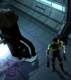
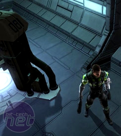
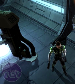
There are two main components to any in-game object, the model itself and then the texture that wraps around it. A decently hi-res texture can disguise all number of sins and blemishes, while a low-res one will make your eyes feel like they’ve been scrubbed with sandpaper.The differences between the settings here are subtle to the point of non-existence, but a careful eye can maybe just make out that in the High and Medium settings the textures and panels of the background are perhaps a touch more defined – though it is negligible.
At the end of the day, Space Siege isn’t a very demanding game graphically – the recommended is an Nvidia 8 series or better, with 1GB of system memory, however we found running it on a GeForce 8600 GTS we could only run it in medium settings at a screen resolution of 1280x1024 (this was Rich's PC during our co-op session), not that it really mattered. It may not offer a truly noticeable (dis)advantage, but like always it certainly can’t hurt to turn it up where possible.
Model Detail
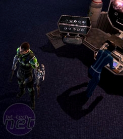
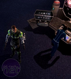
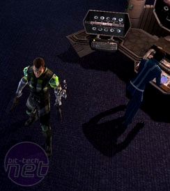
Ah, the other main component of all in-game objects. What we’re hoping for here is a good amount of scalability on the model slider, with objects on the high-end being well-rounded and realistic looking, while lower-end stuff should look sharper, more jaggy and contain fewer polygons.Again, Space Siege only has limited graphics tweaking options (both in general and for this setting in particular), but we’ve done our best. Check out the screenshots below.
Again, the problem here isn’t that the models are low-quality, as even from this close-up viewpoint they are perfectly OK and you’ll spend the entire game zoomed much farther out anyway. Instead, the issue is more that there isn’t really a discernable difference on any of the settings, either on the player character or the surrounding objects.
The reason for this could be simple. Since Space Siege makes heavy use of physics (Nvidia PhysX, actually) and has plenty of body parts and inexplicably explosive boxes flying around the screen, the models may be kept consistent to avoid problems on that front. No good having a physics model with a shape that doesn’t match the actual model, is it?
Either way, the result is that there doesn’t seem to be much variation on either the texture or model fronts. You look at the screenshots and, aside from enabling or disabling shadows, that is what the game will look like it seems. Shove the settings as high as you can and then forget about them.

MSI MPG Velox 100R Chassis Review
October 14 2021 | 15:04




Want to comment? Please log in.