Hot Polygon Action
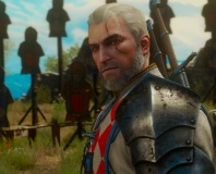
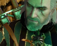
The graphics in The Witcher are, if I’m going to be really blunt, a little bit schizophrenic in my opinion. In the screenshots, which are naturally all taken on highest detail, they look pretty good but in-game it’s a slightly different matter.The main problem is clipping and moving around. Using an isometric view and using WASD to move around is a little bit odd because Geralt will often start moving before his running animation starts. If he’s carrying multiple weapons then you’ll spot them clipping through each other regularly and, let me tell you, it ruins the immersion an awful lot when you see an axe continuously bounce straight through the blade of your sword.
We also had a few problems with framerate, despite running Vista with 2GB RAM and a GeForce 8800 Ultra which was freshly swapped into the system in preparation for Crysis. The framerate problems were odd in that they only happened occasionally. We’d be running along fluid as the wind, then the framerate would drop to a slideshow. I’d stop, restart and return to the same spot to find the problem vanished.
Crashes also plagued the adventure and the game would often freeze or return to desktop inexplicably, both running natively and with the latest 1.1 patch. Either way, we’ve broken down the graphics for you below so that you can gauge how the game may look on your system. The Witcher uses the Aurora Engine from BioWare.
Texture Detail
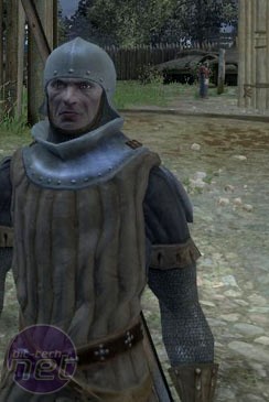
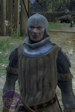
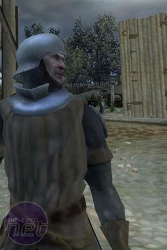
There are three settings for the texture detail slider – high, medium and low. We’ve got screenshots of them all, so check them out below and read our thoughts.We chose this screenshot because the armour of the guard in the picture perfectly illustrates the effects of this setting. See how his leather jerkin gets more blurry the lower the setting goes? We’d really suggest putting this setting as high as possible because the quality of the textures is one of the things which will be most noticeable.
However, there are some other settings which you may want to give preference too…
View Distance
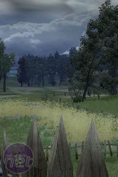
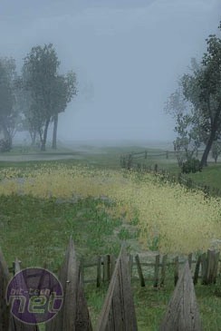
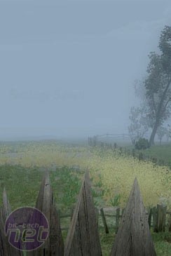
View distance has three settings to choose from – far, medium and near. Far is better and will let you see more of the details on the horizon, but we’ve got shots of all three.The view distance is one of the most important settings in the game, especially if you play with the OST camera most of the time. With the view distance set to high you’ll be able to see the clouds and distant details, but if you drop the setting even to medium then you’ll have to cope with a grey fog of war which makes it feel like you’re exploring a word covered in nanite goo.
In other words, view distance is the setting you should probably insist on having set to full, even if you have to compromise texture quality as a result. Anyway, moving on let's look at the other settings.

MSI MPG Velox 100R Chassis Review
October 14 2021 | 15:04




Want to comment? Please log in.