The Art of Zeno Clash
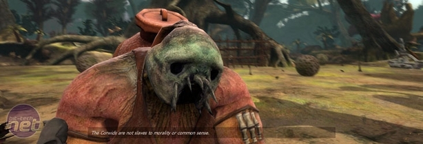
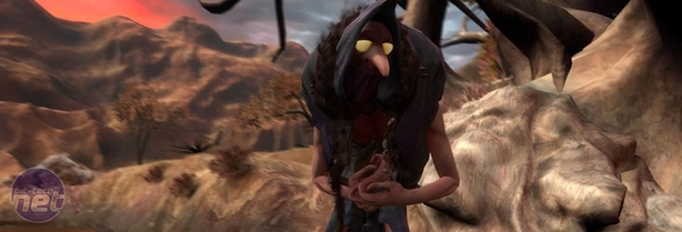
bit-tech: The design and art of Zeno Clash is incredibly and deliberately striking – where did you look for inspiration when designing the game?Andres: For Zeno Clash we were looking for something not seen in the first-person genre. We started looking for sources of inspiration that were not from the video game industry or the blockbuster movies. We were very interested in the work of illustrator John Blanche. We got acquainted with his work through some adventure books that featured his illustrations (The Crown of the Kings adventure books from Steve Jackson).
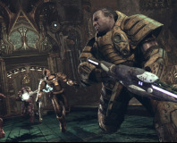
We also looked at traditional art as a source of inspiration. The paintings of XV century painter Hieronymus Bosch had fantastic creatures and designs that we could refer to. Another great source of inspiration was The Dark Crystal film from Jim Henson & Frank Oz. The world and the characters featured in that film are absolutely marvellous. Not even the rocks and the plants are real. They were designed to convey the idea that the characters were in a world nothing like our own. But that world also has mountains, woods, deserts and the animals that live there. We wanted to do the same; build a world where everything was immersed in a particular art style.
The direction of the final art style was developed by Edmundo Bordeu, our art director. Edmundo had his own style to add to the mixture. The end result is something we’re very proud of. We’re definitely happy with the surreal art style and we’ll definitely continue to look at sources of inspiration that are not traditionally seen in video games.
BT: How important do you think the art direction has been to getting the game noticed and developing the player experience? It seems like it would have been an entirely different game if the setting had been more traditional or contemporary?
AB: The art direction is one of the key features of the game and to many it is the feature that stands out the most. The surreal environments and bizarre characters are definitely the first thing that catch the eyes of unfamiliar players.
As I mentioned previously, the unprecedented art style was a concious decision; we wanted to stand out through innovation. From a technical point of view we knew we couldn’t compete graphic-wise with big budget games, but the technical aspect of the graphics is only a part of the equation. I think many consumers are starting to look more at the artistic qualities of graphics. I’d rather experience a visual compelling world, than a dull one with fantastic shadow and light effects, independently if I’m interested in photorealism or not.
BT: Were you ever worried that the design might have the opposite effect and put people off playing the game if it looks too unfamiliar?
AB: Yes, we knew when we chose this direction that we were making a ‘love or hate’ game. And we know it’s probably not for everyone. But still, I think we’ve managed to capture the attention of many people that were on the fence. The press reviews have been very positive, and the general reception has also been extremely good.
Perhaps many people are still undecided, but that should change when we release the demo - probably in the next week. Still, we have not received any kind of feedback that indicated that players that made blind purchases regretted it. Actually, it’s been the opposite; I’d say everyone is enjoying it for different reasons.
For some it’s the surreal world, for others it’s the engaging melee combat. I’m not saying that it’s perfect, every game can use improvements here or there. However, we are very interested in our current customers' feedback and we’ll be giving the game a lot of support to keep it alive, long after the release. In summary, I’m confident enough to say that we are delivering a great experience for a good price.

MSI MPG Velox 100R Chassis Review
October 14 2021 | 15:04




Want to comment? Please log in.