Shoji
A shoji is an essential component of traditional Japanese architecture. In lay terms, it is a sliding door or room divider consisting of a wooden frame and translucent washi paper. Of all the design elements on Sangaku, it is these shoji that will instantly give the case that quintessential Japanese feel.Nick's wood of choice for these sliding doors was sitka spruce. For those not into woodwork, a mortise and tenon joint is a simple method of joining two pieces at right angles to each other. The mortise is the hole, and the tenon is the tongue. Or if you prefer computer cable terminology, the mortise is the female connector, and the tenon is the male plug.

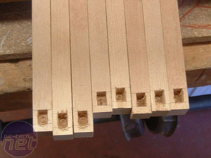
Proving that there is still a need for a skilled hand in this modern age of power tools, Nick found that both a router table and a (admittedly blunt) dedicated mortising machine produced unsatisfactory results. Because of the way a mortise & tenon joint derrives its strength and rigidity, it is important to get a really snug fit. In the end, nothing beat Nick's keen eye, sturdy hand and sharp chisels.
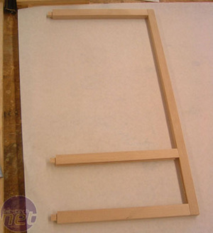
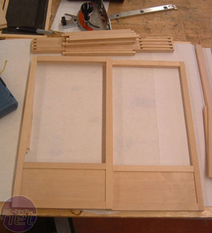
Here are two semi-complete shoji. The bottom panels are in place but the smaller, criss-cross grid members, or kumiko as they are called, are not yet in place. Don't underestimate the sheer amount of time this next stage took - there are 21 joints per door, bring the grand total to 84 joints, cut by hand. As with all top mods, and modders, you have to admire Nick's commitment and attention to detail.
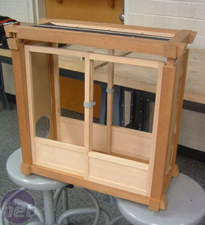
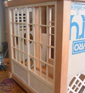
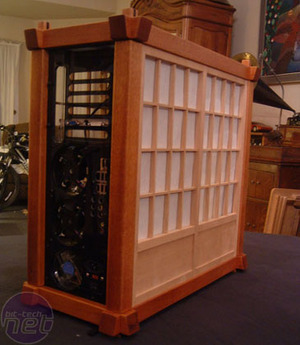
A quick check that everything is square and thanks to the wonders of the Interweb, we get to fast forward many hours to see what the full shoji frame looks like. This is the back side of the case - you can just make out the 'open' side through the lattice. The original design called for sliding doors on both sides of the case but it would be pointless to slide back one shoji to reveal the back of the motherboard.
To improve things, Nick modified the work he had already done to create one single double-wide panel. The sliding shoji on the open side would be fitted with clear perspex to act as a window-mod of sorts, but on the rear, Nick had a different concept in mind.
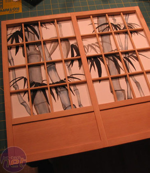
After some consultation with the bit-tech forum regulars who had set up camp in his worklog, Nick planned to fill the backside panel with a white, opaque acrylic and backlight it with bright, white light. As it happens, Nick's sister, Stephanie, is a dab hand with a paintbrush and created a bamboo-themed watercolour to add yet more to the wow factor of this project.
Let's pull back the curtain on this backlit panel, shall we?

MSI MPG Velox 100R Chassis Review
October 14 2021 | 15:04


Want to comment? Please log in.